Overview
Company: Piano Analytics — analytics platform used by major publishers and media companies worldwide.
Product: Core design system — shared component library used across all Piano products.
Role: Sole designer on the audit. Built most of the original components, volunteered to lead the accessibility review when new requirements emerged.
Timeline: ~2 months (alongside regular product work).
The Challenge
New WCAG 2.2 requirements came up. Since I had built most of the design system from scratch, I took ownership of the audit — review all components and bring them to AA compliance.
The main challenge: make the system accessible without breaking the existing visual language.
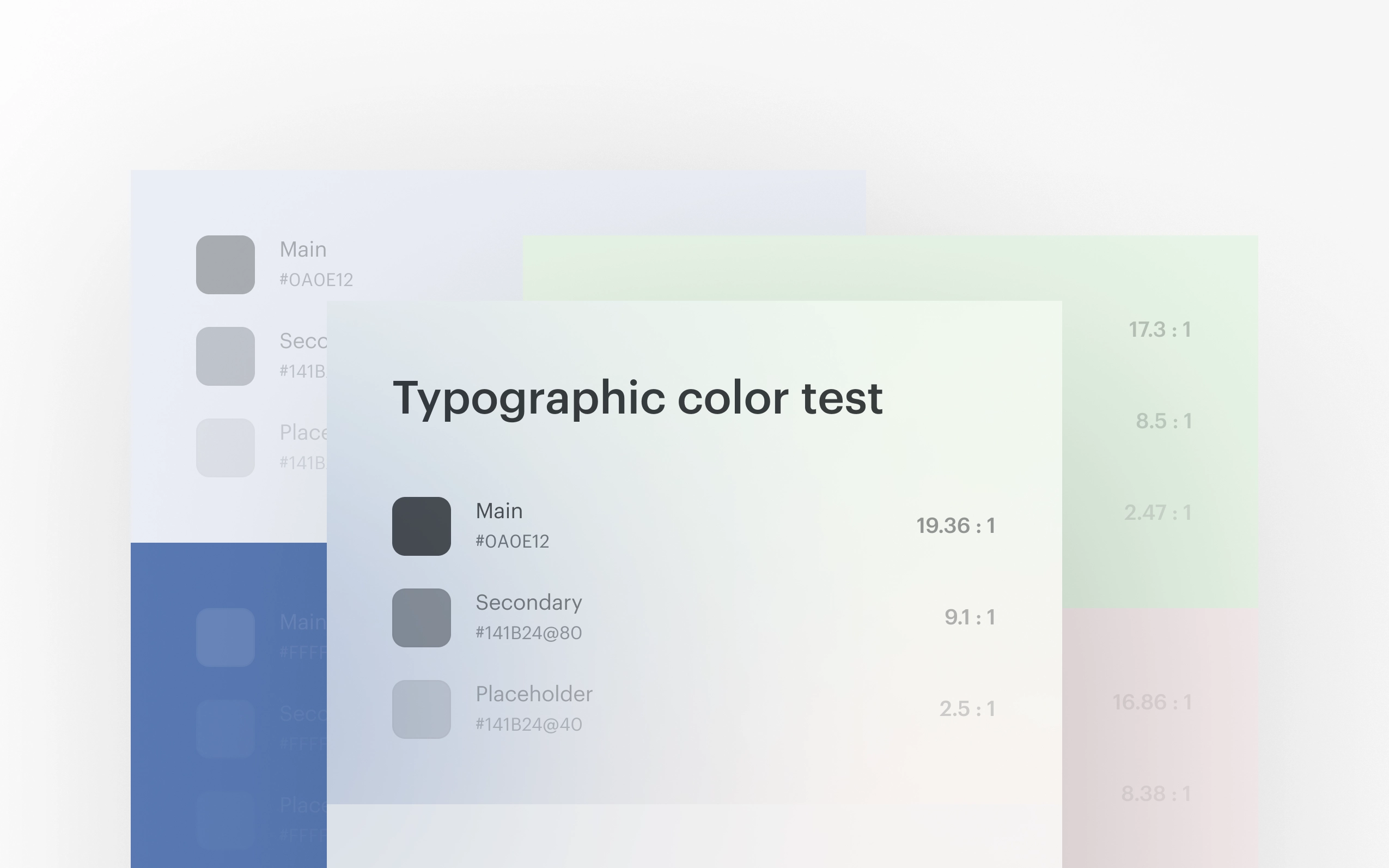
Key Insight — Boundaries Clause
I expected massive changes — we had contrast issues with button backgrounds, input borders, checkboxes. But digging deep into the spec I found SC 1.4.11 (Non-text Contrast): an element doesn’t need 3:1 contrast on its own if its boundary isn’t the only indicator of its presence.
This means: light buttons, subtle input borders, and checkbox outlines can stay — as long as there’s a label, placeholder, icon, or layout structure making the element distinguishable.
This insight preserved the product’s visual style and reduced the scope of changes dramatically.
What I Audited and Fixed
Full audit: buttons, inputs, checkboxes, radios, toggles, alerts, icons, messages, all typography.
Key issues and solutions:
- Text and icon contrast: placeholders and icons using alpha colors had ~2.7:1. Increased opacity from 40% to 50–65% — minimal visual change, full compliance
- Clickable areas: checkboxes, radios, toggles, and icon buttons were below 24px. Increased hit area via padding, preserving visual size
- Focus states: old focus had ~1.5:1 contrast. Introduced a unified high-contrast focus ring for keyboard navigation via :focus-visible
- Error handling: WCAG requires text description of errors, not just color. Proposed three options to the team, chose the best fit for our UI
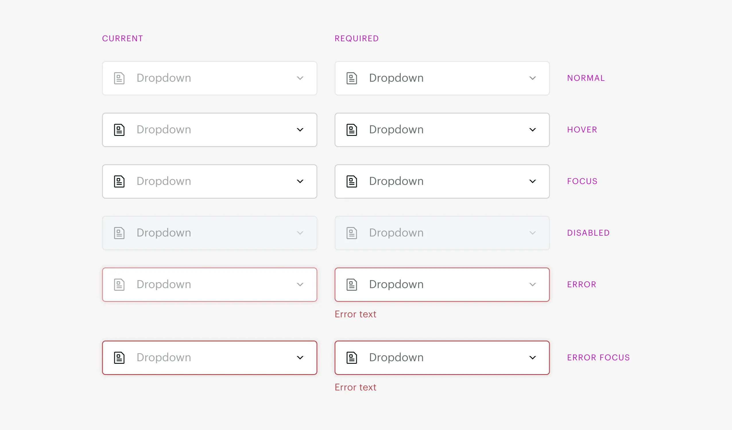
Inputs before and after — minimal visual changes, full AA compliance
Process
- Audited all components against WCAG 2.2 AA
- Prepared documentation with issues, solutions, and rationale
- Created summary tables of requirements for buttons, fields, and controls
- Led a team meeting — presented findings, discussed open questions, collected decisions
- Recommendations accepted, implementation in progress
Decisions & Trade-offs
-
AA level, not AAA: realistic balance between accessibility and scope of changes for an existing product.
-
Boundaries clause instead of blindly increasing contrast: preserved visual language without violating the standard.
-
:focus-visible instead of :focus: focus ring only visible during keyboard navigation — no visual noise for mouse users.
-
Hit area increase via padding: meets 24px minimum without changing visual component size.
Reflection
The main lesson: accessibility is a strategy, not a checklist. Blindly following every WCAG criterion would have meant redesigning the entire UI. Deep understanding of the standard allowed me to find an approach that’s both compliant and preserves the product.
What I’d do differently: bake accessibility requirements into the design system from day one — then the audit would be a verification, not a correction.